Email
Email
Vancouver-based designer specialising in branding and digital design.
Vancouver-based designer specialising in branding and digital design.
Vancouver-based designer specialising in branding and digital design.
Future Legends
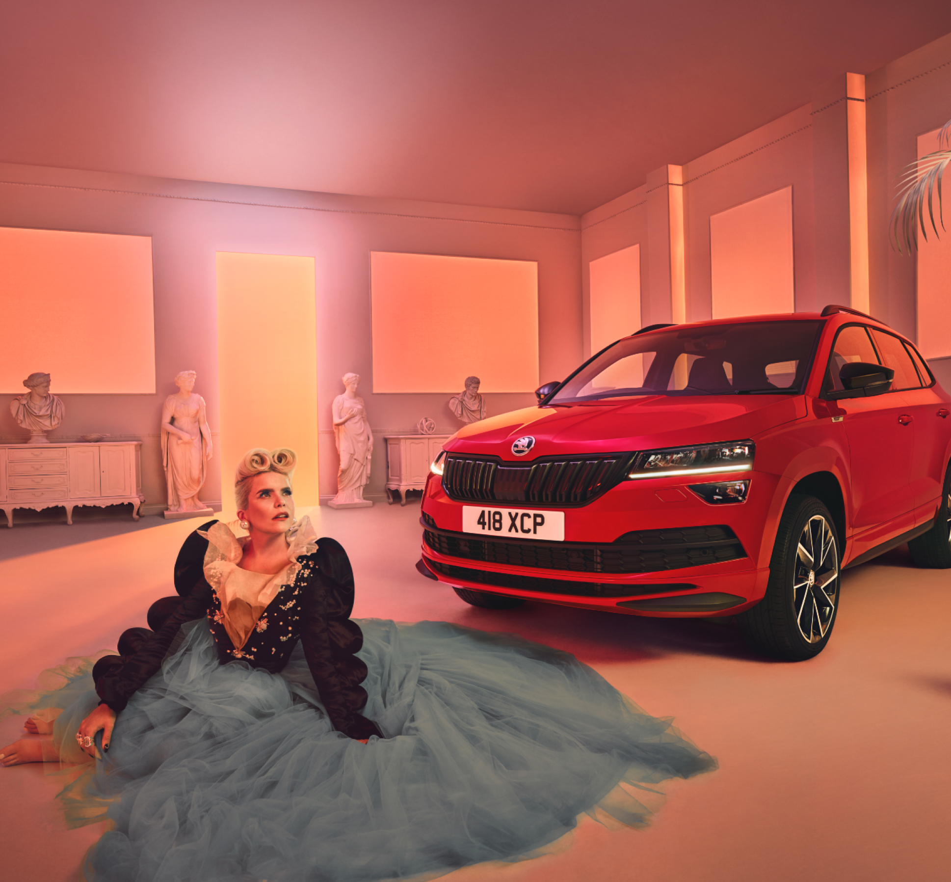
Skoda
Vaster
Ronald McDonald House New York
ICG 669
Craftsman Collision
Bon Macaron Patisserie
Allora
Golden Ireland
TaskHuman
Back to the top
© 2022